
Typology: A Handbook on the Fundamentals of Typography by Jason Tselentis
Book starts with quote I really like:
“Type is so much a part of our daily life that it’s invisible, yet quite visible.” -Steven Heller 2007
In previous book review I wrote that typefaces reflect the ‘real-world’, here is one example of it. Zuzana Licko is a typeface designer of Emigre, Matrix, Modula, Filosofia, Mrs Eaves and Mr Eaves but at the same time she dedicates her spare time to rendering ceramic vessels. She says that both disciplines deal with balanced shapes, inside and outside form and transition of curves. At the end both a vessel and a letter have to be stable.
1: FORM
When considering what typeface to use for an identity it is important to choose a font that will evoke the attributes of the organization, service or product. Things that should remain consistent: The mark should be appropriate and embraceable, legible and effective. The visual sign can also be literal, like adding symbol as a part of a letter.
This actually reminds me of a TEDx video I watched yesterday: How to become a memory master talk by Idriz Zogaj where he explains that our brain loves to play games and that we remember things better if we connect them with funny associations.
2: COMPOSITION
image = skin and bones of your design
grid = the skeleton
(This explains why a number of designers starts with thumbnails in order to lay the foundation for all visual elements to come.)
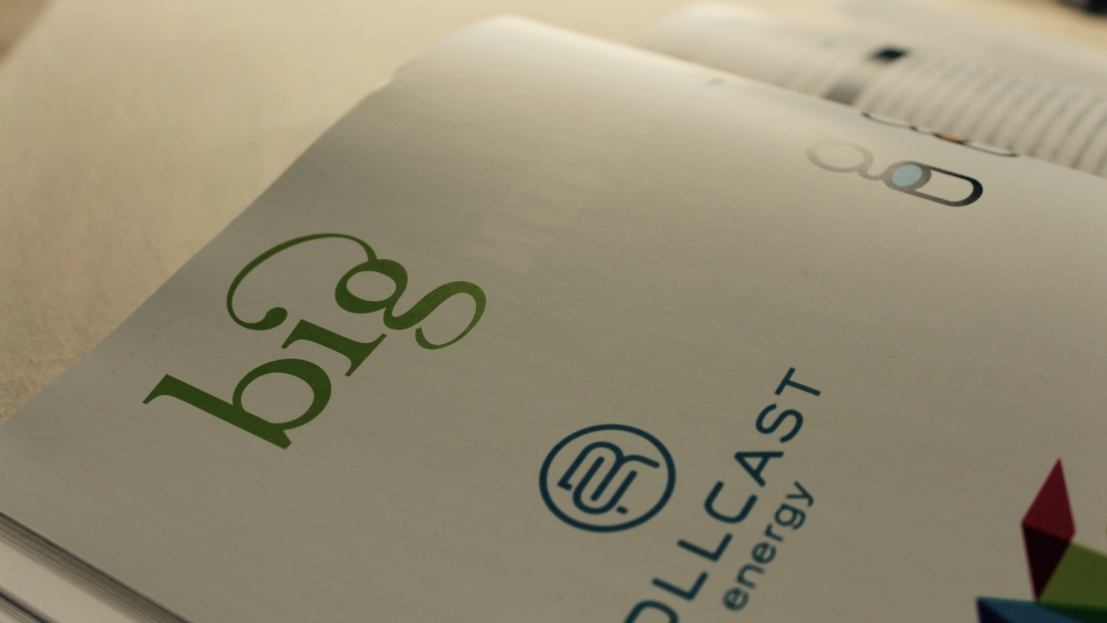
“Designers have to understand typography to effectively communicate with it. How the letterforms relate to each other, how the typography relates to the rest of the design, and how the target market reads the message are all extremely important.” -Words with Amanda Altman
In this chapter Amanda also explains what is well executed typography on BIG (Business, Innovation and Growth) group example with words: “It says what you want it to say, without saying it.” While designing a logo she focused on company’s goals which were: growth, approachability, professionalism and innovation. An interesting decision she made is that to express approachability she use lowercase serif letters and conveyed growth by using visual message connecting g and dot on i in an arch.

3: PRINCIPLES
“Good design, at least part of the time, includes the criterion of being direct in relation to the problem at hand-not obscure, trendy or stylish. A new language, visual or verbal, must be couched in a language that is already understood.” -Ivan Chermayeff 1989
4: EXPERIMENTATION
“Type can be a tool, a toy, and a teacher; it can provide a means of livelihood, a hobby for relaxation, an intellectual stimulant-and a spiritual satisfaction. I believe an avid interest in Type necessarily includes a zest for everyday life.” -Bradbury Thompson 1956
You can get this book here:
